2013 MacPherson Curatorial Fellow Nava Streiter interviews exhibition curator (and former MacPherson Fellow) Anna Moblard Meier on “Beneath the Printed Pattern: Display and Disguise in Ukioy-e Bijinga.”
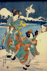
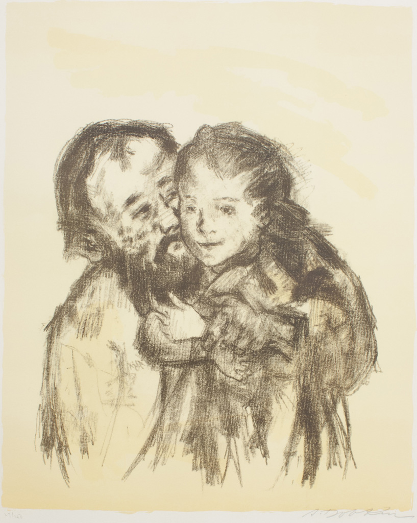
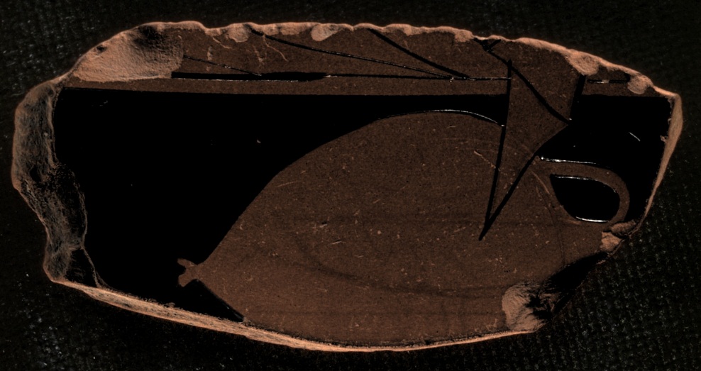
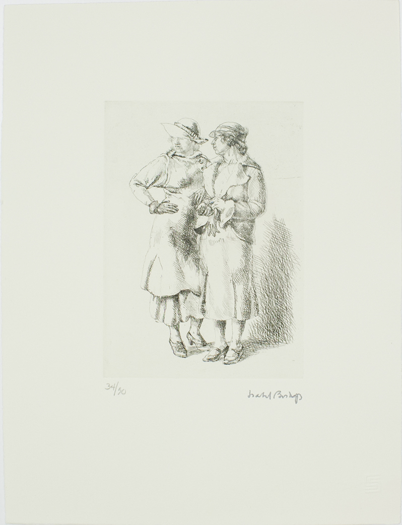
Utagawa Kunisada II, Mitsuji Near a Carriage in the Snow, ca. 1851 (detail). Bryn Mawr College Special Collections; gift of Margery Hoffman Smith, Class of 1911.
Nava Streiter: “Beneath the Printed Pattern: Display and Disguise in Ukiyo-e Bijinga,” is an exhibition of ukiyo-e prints from the Bryn Mawr College Special Collections, on display in the Class of 1912 Rare Books Room in Canaday Library between September 25, 2013 and December 20, 2013. I sat down with the show’s curator, Anna Moblard Meier, who is a third year graduate student in Bryn Mawr’s History of Art department, to discuss what the show says about idealization, eroticism, marketing and politics in nineteenth-century Edo.
N: The written description of the exhibition notes that the bijinga, or beautiful people, who appear in most of the artworks are idealized representations, carefully designed to convey particular messages. It strikes me that many of the images in the show are also constructed as scenes from the everyday life of Edo. What do you think it means to combine idealization and apparent realism in this way?
A: While the images do depict people shopping in the capital city or visiting the famous places of Edo, the “everyday” quality of the works is highly orchestrated. Every detail of these images, from the posture of the depicted figures to the surrounding context, is constructed in such a way as to create a specific meaning.
The section on famous places makes a good example here. There’s a long-standing tradition in Japanese art of the meisho, or the famous place. This tradition comes out of poetry and painting, and the representation of places tied to the royal family, to natural phenomena (like cherry blossoms). In ukiyo-e, representations of the famous places of Edo draw from this older tradition. In them, the idea of the meisho is applied to Edo, the capital city, as a group of new famous places, literally marketing the Shogun’s capital.
In the case of bijinga, picture of beautiful people, as the guest speaker Julie Nelson Davis explained in her lecture at the exhibition’s opening, these images are also filled with markers. For example, ukiyo-e makes many references to the classical tradition of the Heian court — the heyday of Japanese court culture. To the contemporary viewer, a woman depicted reading poetry or seated amongst stacks of books would have been recognized as a courtesan of that was not only cultured and hence desirable, but also high-ranking and expensive. (You can see an image of such a woman in the show.) These sorts of references were common, especially because literacy in Edo was extremely high during this period.
N: Could we describe the prints in this show as popular art?
A: Yes, although we could even question whether they would originally have been understood as art. It wasn’t until the Meiji restoration in the late 1860s that a word for art appeared in Japanese.
N: Is there any ideological or etymological connection between the word for art and the word bijinga?
A: The Japanese term for art is bijutsu and I don’t think it has anything to do with bijinga. I don’t think the western aesthetic notion that art and beauty are inherently combined can be applied to ukiyo-e works or the idea of bijinga, which, again, literally translates as pictures of beautiful people. Still, ideas of beauty, the beauty of the natural world, and the ability to represent these beauties are central to all forms of Japanese art — to what, in western terms, would be call the “applied arts.”
N: In light of Japanese ideas of art and beauty, what does it mean for your show on beautiful people to include a section on representation of natural phenomena?
A: In addition to bijinga, the majority of ukiyo-e artists also produced pictures of birds and flowers (or kacho-e). Although they were part of a minor genre, these images of nature drew from long traditions of Chinese and Japanese painting. Like references to classical literature and the Heian court, the formal qualities of these works tied ukiyo-e to a prestigious artistic lineage. I hope the viewer sees a parallel between the attentive detail of these depictions and of the show’s bijinga imagery. Also, throughout the show, women are depicted in elaborate kimonos, and the textile designs are central to the compositions. The natural forms of flora and fauna served as a basis for these designs.
N: Speaking of textiles, it’s interesting that the idea of the beautiful person was so tied to the idea of the beautiful garment. I understand many of the images are advertisements for the Yoshiwara, or red light district of Edo, but their eroticism seems very subtle. There’s so much clothing! What am I missing?
A: The eroticism in the prints is subtle to us, but it wouldn’t have been subtle to the original audience. For example, during the Edo period, the back of a woman’s neck was considered incredibly sexy and so were her wrists. Also, the way the kimono is folded in a lot of ukiyo-e drew attention to specific curves. Many of the images would have been read almost like pin-ups to Edo period viewers, although they don’t necessarily read that way to modern western ones. That’s one of the key elements of the show — to give the contemporary viewer access to the ways these images would have functioned during their time period and to recreate a sense of them as complex, legible surfaces containing signs that are very specific.
For instance, there’s an interesting innuendo in a photographically reproduced picture of a geisha that is in the show’s bookcase display. The image is from a series by the famous artist Kitagawa Utamaro. In it, the viewer doesn’t see the geisha’s patron, but sees her holding a man’s robe. There’s a reference to classical painting on the man’s kimono and, from that image, the viewer would know the patron was a merchant. Merchants in that period were not allowed to show their wealth, even though they were amongst the wealthiest people in Edo. So they would have a beautiful silk paintings embedded inside their kimonos as a private display of their wealth and prestige.
N: So the only nudity in a show about pleasure district prints is off-stage nudity! That’s great. Would the merchant have commissioned the print? Are the high classical references a form of posturing?
A: In these sorts of images, the patron of the Yoshiwara was represented as a sophisticated, cultured gentleman, but I think that’s more something that’s being sold to the merchant patron than the merchant patron commissioning it as a way of self-identifying.
N: The prints weren’t commissioned? How and why were they made?
A: Several scholars, including Julie Nelson Davis, have suggested that the brothels themselves might have commissioned these works as advertisements, and it’s clear that textile designers and theaters also commissioned prints. However, there’s a lot we don’t know, because of the complexity of ukiyo-e production. It was incredibly complicated to make these prints. A publisher would commission an artist to make a drawing. The names we associate with ukiyo-e, like Hiroshige or Hokusai, were the people who made the drawings. Their work would be given to a lead designer, who would transfer it onto a wooden key-block. Then the blocks would be given to carvers. There were two different types of carvers. The most skilled ones would carve the most important parts, including the contour lines and the key-block. Less skilled carvers would cut all of the additional blocks that gave color and detail to the prints. Next the carved blocks would be given to printers. Printed images would be given to the publisher, who would sell them in the streets and shops of Edo. There were also travelling book salesmen, and shops where you could buy prints.
N: So although it seems like research on ukiyo-e prints tends to focus on prominent artists, the works were really made by a huge number of people. Is the emphasis on individuals a western misinterpretation, or were people in Edo interested in celebrity artists?
A: Julie Nelson’s book, Utamaro and the Spectacle of Beauty, makes the argument that Kitagawa Utamaro, for instance, was essentially a brand. The publisher who made Utamaro a household name, created a persona for him, which made the prints more marketable. So the name Utamaro carried weight in Edo, but a weight comparable today, for instance, to Coca-Cola or to some other big brand name.
N: Western responses to ukiyo-e prints are fascinating. How has your perspective informed your work on the show?
A: I’m realtively new to the field, but I’ve been studying Japanese now for two years and have heard many of Julie Nelson’s lectures about the Edo period and Japanese art in general. Julie’s been incredibly generous and kind in sharing her knowledge!
My interest, really, has been in considering, from the western perspective, what happens when these prints appeared in western culture. Many ukiyo-e works survived in the west from a time period when, because of natural disasters or the sentiments of the Meiji restoration, many others they were destroyed in Japan. However, in the west, the surviving works were largely decontextualized and misunderstood.
In Japan in the 1870-90s, ukiyo-e was largely censored, and Japan was struggling to promote a new national identity and to avoid becoming a colonized country. In presenting itself to the West, it wanted to promote the new Meiji Japan as modern and industrial, while still preserving the value of its ancient and complex culture. Although ukiyo-e formed the basis of western visions of Japan, it did not fit into the image of “new Japan” that was being formulated and promoted internally. Japan’s new government was trying to figure out how to place the country as a prominent, new force in a globalizing world. For example, during this period, the government realigned its identity with Shinto over Buddhism. A lot of incredible Japanese Buddhist paintings have come to the west because they were not valued during the Meiji restoration. In viewing ukiyo-e and reading its histories, the first of which were written by westerners, all of these things come into play.
N: Speaking of Buddhism, is there a religious aspect to the works in the show? Is the idea of the beautiful person religious in any way?
A: Not really. The term ukiyo-e, means pictures of the floating world. Ukiyo literally means “floating world” and the –e ending means “pictures of.” There are Buddhist connotations associated with the term ukiyo, for instance, the term references a poem that compares life’s ephemerality to a gourd floating on a river. In the culture of Edo, interest in and contemplation of life’s transience are replaced by interest in the transience of pleasure. There was a celebration of enjoyment, rather than a meditation on the fragility of human life. So ukiyo-e, in the Edo period, becomes a celebration of all life’s pleasure, including the pleasures of the Yoshiwara, the pleasures of the theater, and the pleasures of looking at nature’s beauty.
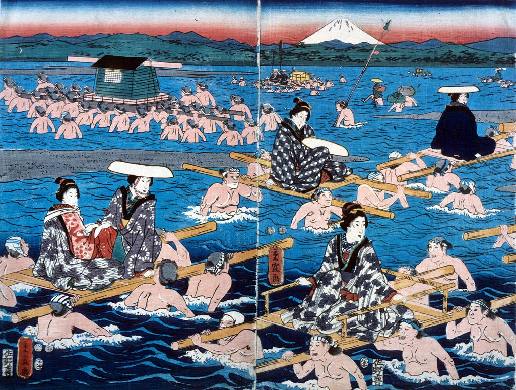
Katsushika Shigenobu, Bathing Scene, n.d., Bryn Mawr College Special Collections, gift of Margery Hoffman Smith, Class of 1911
There’s a lot of parody in ukiyo-e, especially political parody. There’s as much parody of court culture as there is reverence for it. Some theories set the idea of the floating world as a sort of cultural vent for the Tokugawa shogunate. The shogunate regulated life closely during the Edo period and, in order to maintain its dominance over the rising merchant class – the lowest rung of society, but also the rising wealth of society – the shogun passed all sorts of sumptuary laws. Some scholars have suggested that the Yoshiwara and idea of the ukiyo-e’s celebration of all the pleasures of life is sort of a vent for the pressure those laws placed on the lower classes. However regulated, the Yoshiwara was a place where the merchants and townspeople of Edo could feel free and unconstrained by the strict neo-Confucianism of the day. Still, there are any number of scholars who would say that the Edo period wasn’t as structured as all that, and sumptuary laws were very difficult to enforce.
N: So these pictures are fairly radical?
A: Yes, as much as contemporary advertisement can be. Still, sumptuary laws also applied to them. Artists and publishers were required to print seals on all ukiyo-e, so those guilty of breaking laws could be punished. For instance, Kitagawa Utamaro, who I’ve mentioned already, was imprisoned for transgressing these laws.
N: You’ve done a gorgeous job with the show, and it’s appropriately subtle, but, as we’ve discussed, subtlety can sometimes mask surprising content, especially for viewers who are relatively unfamiliar with a visual language. What do you think it does to transplant these prints to our modern, Bryn Mawr gallery?
A: I think that’s a difficulty for the show. One of the things I really wanted to avoid was having another show entitled “Ukiyo-e: the Floating World,” because that’s the most common, introductory way people encounter ukiyo-e. The euphemism of the name is often misinterpreted. I think most people don’t understand that ukiyo-e is largely about the brothel and theater districts, and that the theater districts were a places where prostitution was also conducted. So what was bought and sold in the floating world sometimes gets lost to a western viewer. The reason I chose Bijinga as a specific theme was that I wanted to try to begin to unpack one specific type of image in order to provide a deeper understanding of Edo period prints. Whether viewers interact with it long enough to realize what’s there – that’s always a problem.
N: Well they’ll realize it when they read this. They’re going to be scandalized.
A: The number of times the guest speaker said prostitute made me smile.
N: But there are so many words for prostitute!
A: But they’re mostly euphemisms! There’s only one point in the text of the show that I say sex-worker, but I think it’s important to keep that raw reality in mind when we’re using all these terms and descriptions like courtesan and court lady and “elegant woman in a kimono.” There are so many euphemisms in the terminology of ukiyo-e itself. Ukiyo-e is a euphemism for pleasure districts, which were largely run on indentured servitude, which was a harsh reality.
N: What do you want viewers to take away from the show?
A: The purpose of the show is to provide a deeper understanding of the complexity of ukiyo-e. It’s the tip of the iceberg, as far as that goes. Having come to the subject from western scholarship (and the study of late-19th century Vienna and Germany), I’ve seen how these works were appreciated but completely misunderstood. The show is my effort to realign the discussion according to a fuller original context.
October, 2013.


 Bryn Mawr College Accession Number: 2005.6.36.a-f")
 Bryn Mawr College Accession Number: 2005.6.23.a-d")
 Bryn Mawr College Accession Number: 2005.6.60.a-d")
 Bryn Mawr College Accession Number: 2005.6.41")
 Bryn Mawr College Accession Number: 2005.6.26.a-c")
 (33.02 cm x 63.5 cm) Bryn Mawr College Accession Number: 2005.6.58.a-d")

